Landscape Architecture Assemblage 2D
By Liam Mitchell
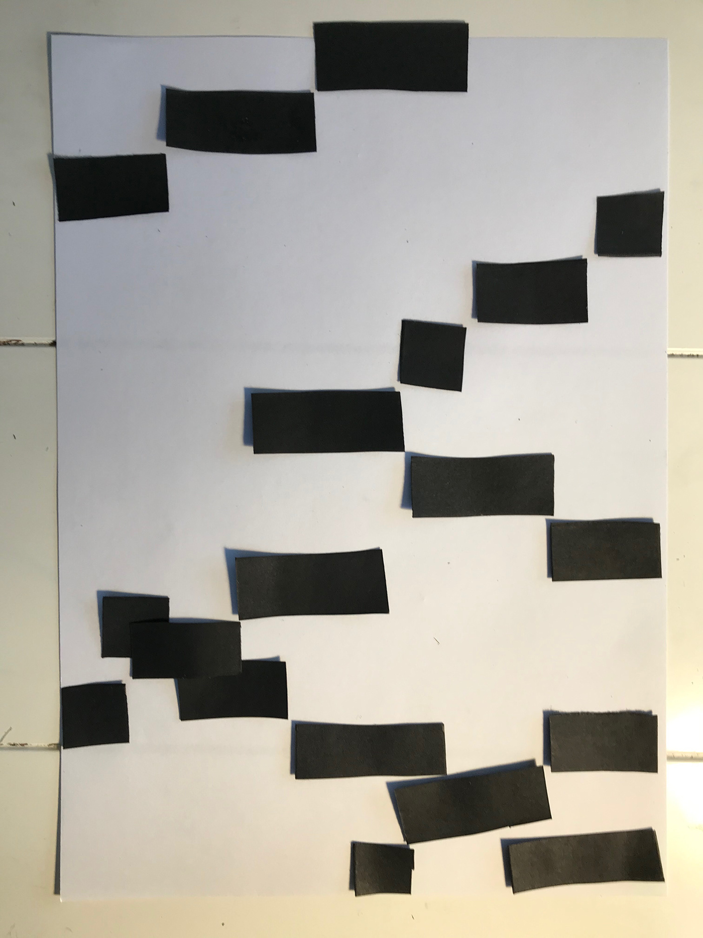
Song sequence

Precedence


Architects
Bjarke Ingels
"Know for innovative and ambitious design approach"


Jean Nouvel
Built square theme building right next to UTS, so he had a huge influence on my work.


1

- Successful design, middle notes create an effective downways iteration.
2

- Change of A notes create a further downwards trend to the design from one before.
3

- The use of notes coming off downwards and to the side create a small wavy design, in which i quite like.
4

- The use of the notes been placed sideways did not work as there was much overlap.
5

- The use if the D notes changes the course of the iteration, but a tad of overlap is shown.
6

-The placement of the notes off the D creates a V shape effect which makes this iteration very unique.
7

- Overlap in the middle which has a negative effect on the design.
8

- The use of using downwards notes makes the iteration very tight and enclosed, in which i find interesting.
9

- Start of design is in the middle and then the design raps around the top which is unique to others.
10

- Middle notes has go straight down instead of sideways, orientating the design, making it unique from start to finish, but overlap is shown.
11

Design starts at the bottom and goes up, making a very tall design.
12

- Design creates stairs effect created by the D note making it unique.
13

- Design almost makes a circle would could look interesting if made in 3D.
14
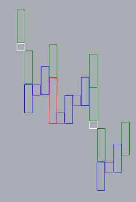
- Design looks like a stock graph, by the up and down trend of the design.
15

- The F notes in this iteration stand out as they are the only notes horizontal.
16

- D note stands out, all notes are vertical, this design is too simple.
17

- Notes come off at an angle, making it unique from other designs.
18

- very long design, creates a downwards stairs effect.
19
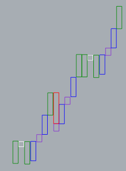
- All notes are vertical, but overlap with the D note
20

- All notes are vertical, to simple of a design, not unique.
21

- Notes diagonally look appealing, but way to much overlap.
22

- Too Simple of a design, all notes are vertical and mainly just goes to the right.
23

- Notes go off the page, only uses half of the page creating a small design which is unique from others, overlap is shown.
24

- One overlap, the use of notes vertical and horizontal create an effective design and very unique from other iterations.
25

- Way to simple, all notes go straight down
26

- Very unique design, top notes differ very much to the bottom half of the page due to the way the E note comes off the D.
27

- The use of vertical and horizontal notes create stairs effect, The notes go off the page quite a bit and little overlap.
28

- Way to much overlap, hard to tell where the starting point of the design is, to confusing.
29

- Unique design, with a range of vertical and horizontal notes, goes off the page quite a bit and overlap at top left corner.
30

- Unique as design takes up most of the top half of the page and straight down notes.
31
- To simple of a design, unique as notes all come of on diagonally, overlap of notes and goes off the page quite a bit.
32

- All notes are vertical, only takes up half the page, to simple of a design.
33

- Notes take up most of the page, some notes go off the page, creates a slide effect making it unique.
34

- Tiny bit of overlap, symeratery with the middle notes making it unique from others.
35

- Notes take up the whole page, none of the notes overlap and creates a section through the middle down the page, but all notes are horizontal.
36

- Notes go off the page a tad
37

-Too Simple, notes go straight down.
38

- No overlap and creates a diagonal pattern.
39

- Notes only use half the page, little bit of over lap.
40

- Symmetrical design in which is very interesting to the viewer from other designs.
